시계열 데이터를 해석하는 방법에 알아보려 한다.
1. Heatmap
# 1. 데이터에서 원하는 feature들만 추출 하여서, 딕셔너리 형태로 만들어줌.

data_dict = {
    'featrue_1': amp,
    'featrue_2': voltage,
    'featrue_3': tem,
    'featrue_4 ': nu,
    'featrue_5 ': cu
}

# 2. DataFrame의 형식으로 변환
df = pd.DataFrame(data_dict)

# 3. heatmap으로 표현.
plt.rc('font', size=12)        # 기본 폰트 크기
plt.rc('axes', labelsize=13)   # x,y축 label 폰트 크기
plt.rc('xtick', labelsize=13)  # x축 눈금 폰트 크기
plt.rc('ytick', labelsize=13)  # y축 눈금 폰트 크기

plt.figure(figsize=(10, 8))  # Adjust the figure size if needed
# annot = 숫치 표기 유무,
sns.heatmap(df.corr(), annot=True, cmap='coolwarm',linewidths = 0.1,linecolor = "white")
plt.title('Correlation Heatmap of Features')

# Show the heatmap
plt.show()
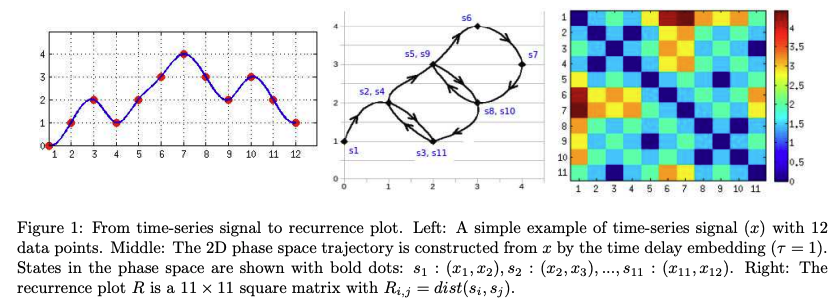
2. Recurrence plot
참고논문 : 'Classification of Time-Series Images Using Deep Convolutional Neural Networks'
참고 블로그: https://blog.naver.com/rkdwnsdud555/221380407792
정의: 시계열 데이터를 m차원의 공간궤적에 나타낸 후 공간궤적에 위치한 점간의 거리를 이미지로 나타낸 것.
import pylab as plt
import numpy as np

def rec_plot(s, eps=None, steps=None):
    if eps==None: eps=0.01
    if steps==None: steps=10
    N = s.size
    S = np.repeat(s[None,:], N, axis=0)
    Z = np.floor(np.abs(S-S.T)/eps)
    Z[Z>steps] = steps

    return Z

s = np.random.random(1000)
plt.imshow(rec_plot(s))
plt.show()

3. GramianAngularField
참고 사이트: https://pyts.readthedocs.io/en/stable/generated/pyts.image.RecurrencePlot.html
정의 : 시계열의 각 값 쌍 사이의 일종의 시간적 상관 관계를 이미지로 나타냄.
import matplotlib.pyplot as plt
from mpl_toolkits.axes_grid1 import ImageGrid
from pyts.image import GramianAngularField


data= 넣고싶은 데이터 작성.

x = np.sin(data)
X = np.array([x])
print(len(X))

# GAF transformations
image_size = 24
gasf = GramianAngularField(image_size,method='summation')
X_gasf = gasf.fit_transform(X)
gadf = GramianAngularField(image_size,method='difference')
X_gadf = gadf.fit_transform(X)

# Show the results for the first time series
plt.figure(figsize=(16, 8))
plt.subplot(121)
plt.imshow(X_gasf[0], cmap='rainbow', origin='lower',vmin=-1., vmax=1.)
colorbar = plt.colorbar(fraction=0.046)
plt.title("GASF", fontsize=16)
# plt.title("Gramian Angular Field", fontsize=16)
# plt.colorbar(im, cax=grid.cbar_axes[0])

plt.subplot(122)
plt.imshow(X_gadf[0], cmap='rainbow', origin='lower',vmin=-1., vmax=1.)
colorbar = plt.colorbar(fraction=0.046)
plt.title("GADF", fontsize=16)
# plt.title("Gramian Angular Field", fontsize=16)
plt.show()
4. 산점도 분석.
Feature간의 특징이 어떤 관계를 갖는지 시각적으로 확인함.
import seaborn as sns
import matplotlib.pyplot as plt

data_dict = {
    'Feature_1': amp,
    'Feature_2': voltage,
    'Feature_3': temp,
    'Feature_4 ': nu,
    'Feature_5': cu
}


df = pd.DataFrame(data_dict)


sns.set(style='whitegrid')
sns.pairplot(df[['Feature_1', 'Feature_2',
                     'Feature_3', 'Feature_4 ']])
plt.show()
'새롭게 알게된_tech > 파이썬_tech' 카테고리의 다른 글
| 16.[파이썬] 리스트에서 가까운 정수,실수 근삿값 찾기. (1) | 2022.11.13 |
|---|---|
| 15.[파이썬] 여러 리스트를 하나로 합쳐주는 zip함수 (0) | 2022.11.09 |
| 14.[파이썬] 데이터를 엑셀 파일로 저장하는 방법 (0) | 2022.11.06 |
| 13. [파이썬] 폴더안의 모든 각각의 파일의 특정열(행) 그래프 출력 (1) | 2022.11.05 |
| 12.[파이썬] 폴더안의 모든 각각의 파일의 행의 개수 세기 (0) | 2022.11.05 |
